Quick Start
Installation
You can install EasyPred via pip
pip install easypred
Alternatively, you can install EasyPred by cloning the project to your local directory
git clone https://github.com/FilippoPisello/EasyPred
And then run setup.py
python setup.py install
Requirements
EasyPred depends on the following libraries:
NumPy
pandas
matplotlib
Usage
The core of the library consists in its four prediction-like objects.
Three of them are proper representations of predictions:
Prediction: any prediction
BinaryPrediction: fitted and real data attain only two values
NumericPrediction: fitted and real data are numeric
Then there is the case when observations are matched to a probability rather than to an outcome:
BinaryScore: prediction output that returns probability scores
Prediction
Consider the example of a generic prediction over text categories:
>>> real_data = ["Foo", "Foo", "Bar", "Bar", "Baz"]
>>> fitted_data = ["Baz", "Bar", "Foo", "Bar", "Bar"]

>>> from easypred import Prediction
>>> pred = Prediction(real_data, fitted_data)
Let’s check the rate of correctly classified observations:
>>> pred.accuracy_score
0.2
More detail is needed, let’s investigate where predictions and real match:
>>> pred.matches()
array([False, False, False,  True, False])
Still not clear enough, display everything in a data frame:
>>> pred.as_dataframe()
  Real Values Fitted Values  Prediction Matches
0         Foo           Baz               False
1         Foo           Bar               False
2         Bar           Foo               False
3         Bar           Bar                True
4         Baz           Bar               False
BinaryPrediction
Consider the case of a classic binary context (note: the two values can be any value, no need to be 0 and 1):
>>> real_data = [1, 1, 0, 0]
>>> fitted_data = [0, 1, 0, 0]
>>> from easypred import BinaryPrediction
>>> bin_pred = BinaryPrediction(real_data, fitted_data, value_positive=1)
What are the false positive and false negative rates? What about sensitivity and specificity?
>>> bin_pred.false_positive_rate
0.0
>>> bin_pred.false_negative_rate
0.5
>>> bin_pred.recall_score
0.5
>>> bin_pred.specificity_score
1.0
Let’s look now at the confusion matrix as a pandas data frame:
>>> bin_pred.confusion_matrix(as_dataframe=True)
        Pred 0  Pred 1
Real 0       2       0
Real 1       1       1
NumericPrediction
Let’s look at the numeric use case:
>>> real_data = [1, 2, 3, 4, 5, 6, 7]
>>> fitted_data = [1, 2, 4, 3, 7, 2, 5]
>>> from easypred import NumericPrediction
>>> num_pred = NumericPrediction(real_data, fitted_data)
We can access the residuals with various flavours, let’s go for the basic values:
>>> num_pred.residuals(squared=False, absolute=False, relative=False)
array([ 0,  0, -1,  1, -2,  4,  2])
The data frame representation has now more information:
>>> num_pred.as_dataframe()
   Real Values  Fitted Values  Prediction Matches  Absolute Difference  Relative Difference
0            1              1                True                    0             0.000000
1            2              2                True                    0             0.000000
2            3              4               False                   -1            -0.333333
3            4              3               False                    1             0.250000
4            5              7               False                   -2            -0.400000
5            6              2               False                    4             0.666667
6            7              5               False                    2             0.285714
There are then a number of dedicated error and accuracy metrics:
>>> num_pred.mae
1.4285714285714286
>>> num_pred.mse
3.7142857142857144
>>> num_pred.rmse
1.927248223318863
>>> num_pred.mape
0.27653061224489794
>>> num_pred.r_squared
0.31250000000000017
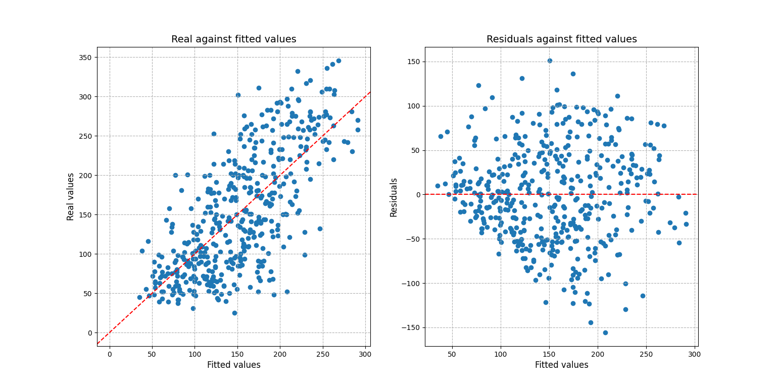
For a more complex scenario one may be interested into visualizing the residuals and prediction fit:
# Setting up the example, creating the prediction
>>> from sklearn import datasets, linear_model
>>> diabetes_X, diabetes_y = datasets.load_diabetes(return_X_y=True)
>>> regr = linear_model.LinearRegression()
>>> regr.fit(diabetes_X, diabetes_y)
LinearRegression()
>>> diabetes_y_pred = regr.predict(diabetes_X)
# Loading the prediction into easypred
>>> from easypred import NumericPrediction
>>> pred = NumericPrediction(diabetes_y, diabetes_y_pred)
>>> pred.plot_fit_residuals()
array([<AxesSubplot:title={'center':'Real against fitted values'},
    xlabel='Fitted values', ylabel='Real values'>,
    <AxesSubplot:title={'center':'Residuals against fitted values'},
    xlabel='Fitted values', ylabel='Residuals'>],
    dtype=object)
>>> from matplotlib import pyplot as plt
>>> plt.show()
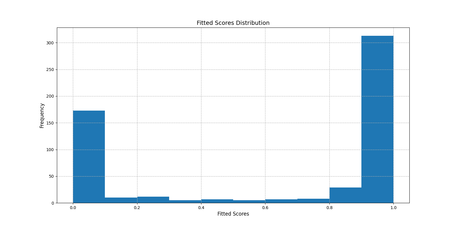
BinaryScore
BinaryScore is to be used when working with probability scores, generally assigned in a 0-1 interval displaying the likelihood of an observation “of being 1”.
Here using one of Sklearn’s datasets:
>>> from sklearn.datasets import load_breast_cancer
>>> from sklearn.linear_model import LogisticRegression
>>> X, y = load_breast_cancer(return_X_y=True)
>>> clf = LogisticRegression(solver="liblinear", random_state=0).fit(X, y)
>>> probs = clf.predict_proba(X)[:, 1]
>>> from easypred import BinaryScore
>>> score = BinaryScore(y, probs, value_positive=1)
First we visualize the distribution of the fitted scores:
>>> score.plot_score_histogram()
<AxesSubplot:title={'center':'Fitted Scores Distribution'}, xlabel='Fitted Scores', ylabel='Frequency'>
>>> from matplotlib import pyplot as plt
>>> plt.show()
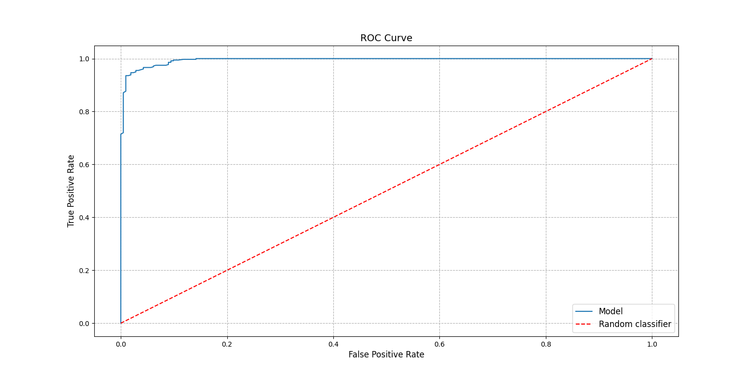
A key metric in this case is the AUC score:
>>> score.auc_score
0.9947611119919667
To better understand the number the ROC curve can be plotted:
>>> score.plot_roc_curve()
<AxesSubplot:title={'center':'ROC Curve'}, xlabel='False Positive Rate', ylabel='True Positive Rate'>
>>> plt.show()
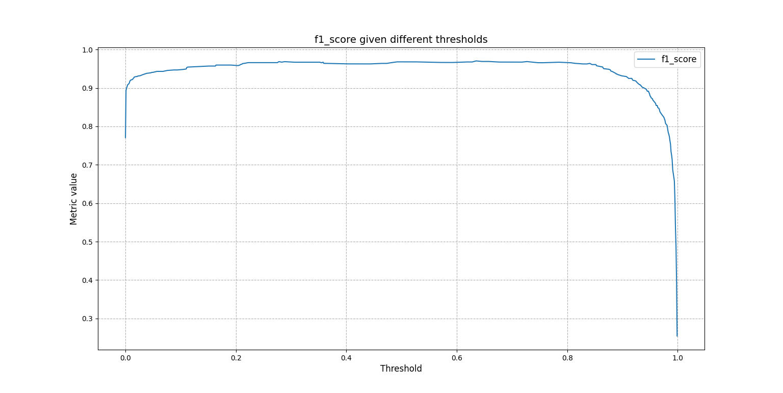
Or one may want to know how the F1 score changes as the threshold to tell 1s from 0s takes different values:
>>> score.f1_scores
array([0.77105832, 0.89361702, 0.89924433, 0.90379747, ...])
The same array can be plotted for a visual understanding:
>>> from easypred.metrics import f1_score
>>> score.plot_metric(f1_score)
<AxesSubplot:title={'center':'f1_score given different thresholds'}, xlabel='Threshold', ylabel='Metric value'>
>>> plt.show()
To get a summary:
>>> score.describe()
                        Value
N                    569.000000
Max fitted score       0.999996
AUC score              0.994761
Max accuracy           0.963093
Thresh max accuracy    0.635000
Max F1 score           0.970464
Thresh max F1 score    0.635000